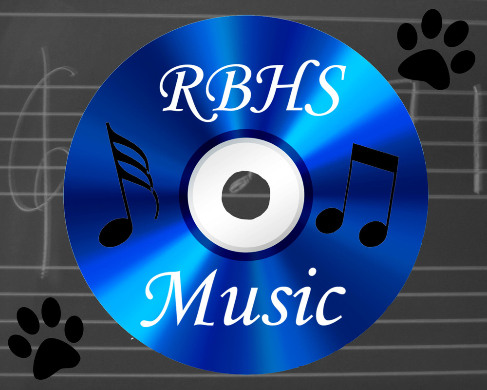
I liked the style of my logo because the white letters contrast with the blue of the CD. The color scheme is the colors of RB, but I can incorporated black too to add a little more color than just blue and white. The CD is the center focus, and I don't think it should be off to the side or anything either. I like the way that the background is a chalkboard with music notes because I think it's a good foreground for this project. The CD is a good symbol of music and I think it was really creative.
|
|
AuthorWrite something about yourself. No need to be fancy, just an overview. ArchivesCategories |
 RSS Feed
