http://www.overstock.com/Home-Garden/Anderson-Design-Group-Chic-Windy-City-Canvas-Art/10426067/product.html
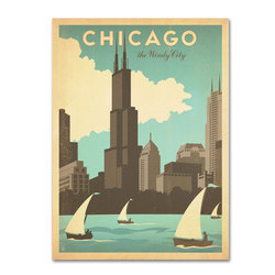
I liked this poster because they're advertising the city of Chicago with the slogan,"The Windy City." I liked how the poster had an older look to it because in the left corner its a darker yellow color to give it a worn out feeling. The font and letters pop out because they're bolded and contrast with the blue background. I also like how from the sears tower the letter "I" is in between the antennas. Besides that, there's graphics incorporated like the sailboat to show how the river is there to invite tourists.
I liked this poster because they're advertising the city of Chicago with the slogan,"The Windy City." I liked how the poster had an older look to it because in the left corner its a darker yellow color to give it a worn out feeling. The font and letters pop out because they're bolded and contrast with the blue background. I also like how from the sears tower the letter "I" is in between the antennas. Besides that, there's graphics incorporated like the sailboat to show how the river is there to invite tourists.
 RSS Feed
